
enter awards


Category Winner
2018
King Koil
CATEGORY
Brand Identity
Visual Communications
CONTRIBUTORS
Adam Gallacher & Nik Dillon, (Alkamee), Paul Guinan and Mel Carroll
Design Challenge and Design Ideas
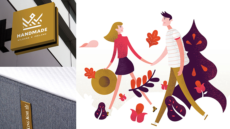
King Koil were being forced by their American franchise parent to adopt the brands global identity, the problem was that, the identity has no global premise and is a budget brand in North America and a quality premium brand in Europe. Manufacturing, target markets and brand associations differed from country to country. Our challenge was to adopt the logotype but build on the sentiment that King Koil has built within the Irish Market. A further challenge was to imbue the brand with warmth, personality and distinction in a sector where everyone looks the same, where all imagery is indistinct and bland and where opportunities to communicate are limited. Our final challenge was to help them clarify and simplify their masterbrand offering balanced against their vast range offering.
How the brief was fulfilled
We first had to negotiate how to adopt the North American brand without harming the indigenous King Koil offering. The North American brand was a low budget product and the brand was not fit for purpose. We worked with the client and marketing teams to create a logotype based on the North American version but which had a simplified alignment and redrawn and refined forms. Thereafter we received agreement that we could build a visual language fit for the market place and which would help to build brand distinction.
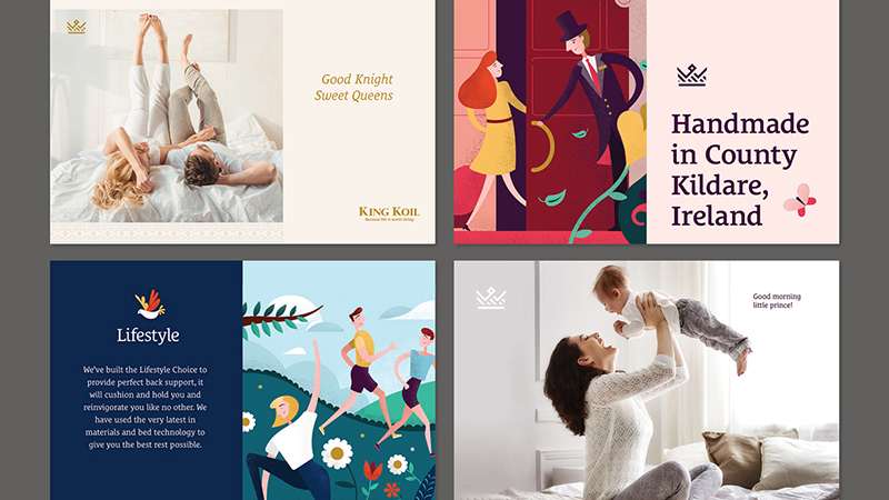
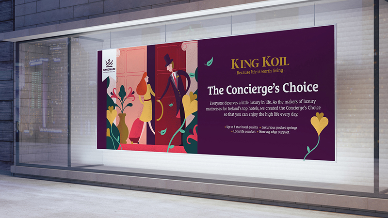
Bed brands so often adopt the same imagery, palettes and approaches, this makes it a dull and monotonous consumer experience, we decided from an early stage to take a different approach. King Koil are the dominant suppliers to the luxury hotel trade and the bed is an affordable piece of everyday luxury, people bought it for that little bit of personal pleasure. We employed the line *“because life is worth living”* to point to both the luxury and also because a great night’s sleep sets you up for a great day. We explored an illustrative approach and subsequently built a masterbrand visual style for King Koil based on quality of life and great shared moments, we didn’t want to show people asleep but point to even greater benefits.
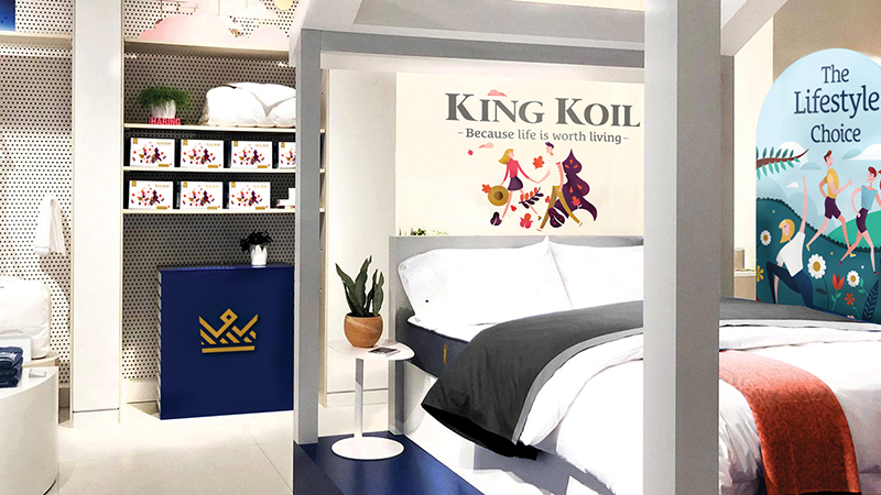
We worked hard with the manufacturing team to simplify the multitude of confusing products into three core product areas, The Lifestyle Choice: where products with back support and health associations are gathered, The Concierge’s Choice: where the luxury beds from the hotel range are found and finally The Craftsman’s Choice: where products filled with all natural fillings are gathered. We created range illustrations to help clarify these offerings.
Finally we created a crown motif that we could use as our quality symbol and further reinforce the handmade and made in Ireland quality of our brand. The kit of parts are designed to be used simply, masterbrand is colour on white, ranges are aligned against a colour, beyond this the brand is completely flexible, warm, friendly, personable and above all totally unique in the category.
You may also like:
Visual Communications
Printed Book Design
WINNER
COMMENDED
HIGHLY COMMENDED
GRAND PRIX
EMERGING TALENT
OVERSEAS AWARD
Freespace – catalogue
Atelier, David Smith and Oran Day
Visual Communications
Photography in Design
WINNER
COMMENDED
HIGHLY COMMENDED
GRAND PRIX
EMERGING TALENT
OVERSEAS AWARD
Town
Salvage Press, Jamie Murphy with Rich Gilligan
Visual Communications
Brand Identity
WINNER
COMMENDED
HIGHLY COMMENDED
GRAND PRIX
EMERGING TALENT
OVERSEAS AWARD
Savvi Credit Union Brand Identity
Alkamee, Adam Gallacher & Nik Dillon
Visual Communications
Packaging: Other
WINNER
COMMENDED
HIGHLY COMMENDED
GRAND PRIX
EMERGING TALENT
OVERSEAS AWARD
The Nature of Things
So&So, Clara Fitzgerald and Seán O'Beacháin
Visual Communications
Use of Typography in Design
WINNER
COMMENDED
HIGHLY COMMENDED
GRAND PRIX
EMERGING TALENT
OVERSEAS AWARD
Town
The Salvage Press, Jamie Murphy
Visual Communications
Illustration: Publishing
WINNER
COMMENDED
HIGHLY COMMENDED
GRAND PRIX
EMERGING TALENT
OVERSEAS AWARD
Alkamee Illustration
Alkamee, Adam Gallacher & Nik Dillon