
enter awards


Category Winner
2018
Keogh’s Popcorn
CATEGORY
Packaging: Food & Drink
Visual Communications
CONTRIBUTORS
Sarah Maguire (True Story) (Lead Designer and Creative Director), Phoebe de Vere White (Client Director), Michael Hagan (Account Director), Peter Donnelly (Illustrator), Aoife O’Sullivan (Photographer), Hilary Goudie (Designer), Aishling O’Flanagan (Designer), Richard Hynes (Production Artist
Design Challenge and Design Ideas
Keogh’s were looking to launch a new brand extension, a premium Irish popcorn, flavoured with natural ingredients from Irish suppliers, and hand popped at the Keogh’s family farm. The range needed to sit well alongside their premium crisp range, but also differentiate itself so that the product offering was clear. As a new product for Keogh’s, they needed to clearly position it within the existing popcorn category and compete with other premium popcorn brands and ‘crisp alternatives’.
Keogh’s needed to find their own angle on why they, as potato experts, can also own a premium positioning in the popcorn space whilst also ensuring the core value of the Keogh’s masterbrand is very much part of this new offering. With the popcorn buyer being primarily female and from a younger age group (25-45) they needed to appeal visually to this market.
How the brief was fulfilled
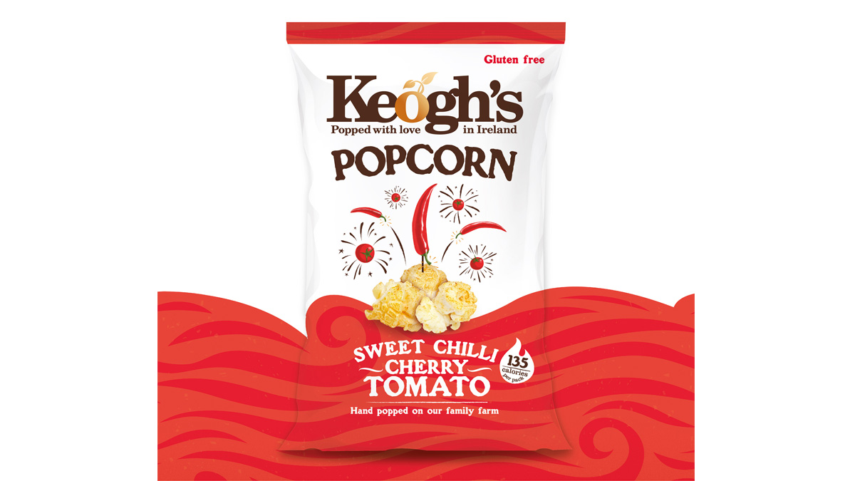
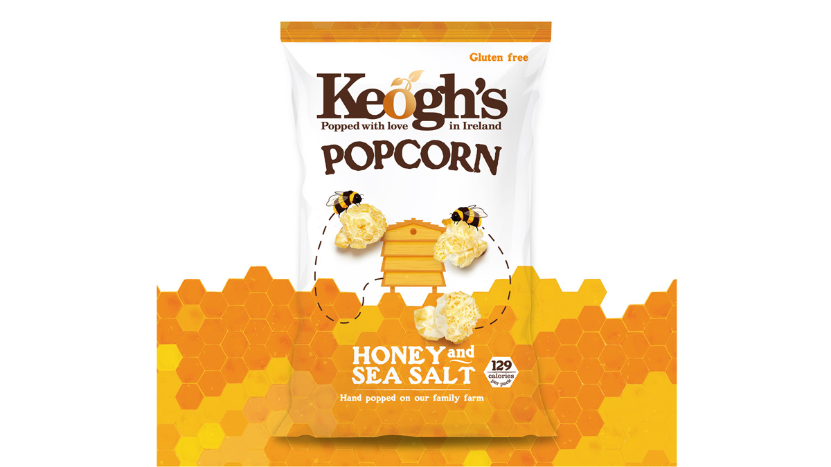
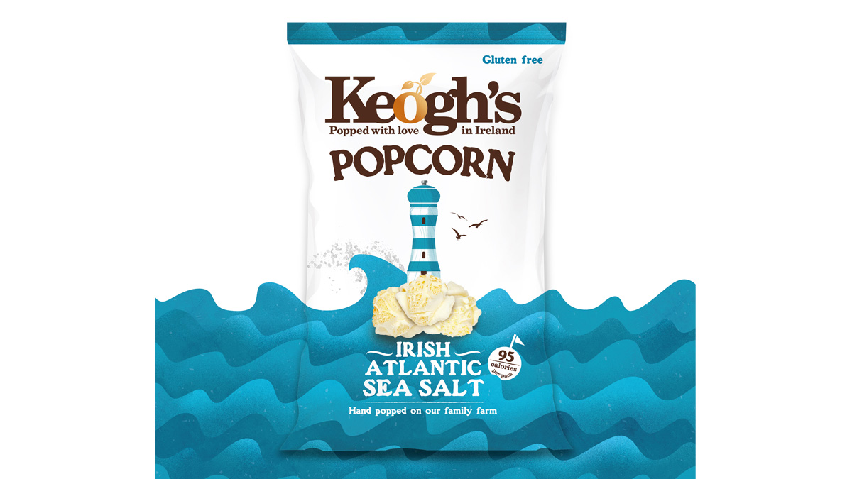
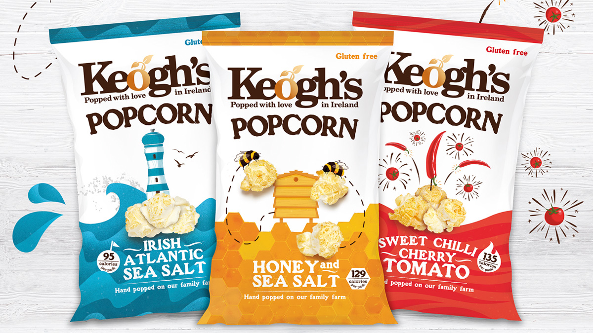
The Keogh’s brand already had a distinctly recognizable Masterbrand and personality that worked really well. Building on these core elements, we created a new range of packaging that was distinctly popcorn and that would express the quality of the ingredients and the amazing taste. A key insight from reviewing the world of popcorn was that white was a critical colour to clearly express the product, so the brand colour cream was changed to white, along with a fresh palette of bright and vibrant colours. We created a visual story for each flavour, built around the natural source of the Irish flavour ingredients; the salt grinder lighthouse, the larger than life busy honey bees, and the firework chilli peppers and tomatoes. We commissioned illustrator Peter Donnelly to create illustrations that brought this world of ‘big flavour’ to life, as well as unique and distinct patterns for each flavour that would create visual excitement and disruption on shelf.
We built on their strapline ‘Grown with love in Ireland’ and customized it to ‘Popped with love in Ireland’ and emphasized that the product was hand popped on the Keogh’s family farm.
For the microwave popcorn packaging, we wanted to express the unique product format, a full cob of corn, that you microwave. The natural format of this was important to show on the box, so product visibility was important through the use of a large window. We shaped the window, and created an illustration around it that made it feel like the cob was growing on the pack. This did two things; it expressed quickly what it was, but also illustrated how the product worked.
You may also like:
Visual Communications
Illustration: Publishing
WINNER
COMMENDED
HIGHLY COMMENDED
GRAND PRIX
EMERGING TALENT
OVERSEAS AWARD
Alkamee Illustration
Alkamee, Adam Gallacher & Nik Dillon
Visual Communications
Use of Typography in Design
WINNER
COMMENDED
HIGHLY COMMENDED
GRAND PRIX
EMERGING TALENT
OVERSEAS AWARD
Town
The Salvage Press, Jamie Murphy
Visual Communications
Printed Book Design
WINNER
COMMENDED
HIGHLY COMMENDED
GRAND PRIX
EMERGING TALENT
OVERSEAS AWARD
Freespace – catalogue
Atelier, David Smith and Oran Day
Visual Communications
Brand Identity
WINNER
COMMENDED
HIGHLY COMMENDED
GRAND PRIX
EMERGING TALENT
OVERSEAS AWARD
King Koil
Alkamee, Adam Gallacher & Nik Dillon
Visual Communications
Packaging: Other
WINNER
COMMENDED
HIGHLY COMMENDED
GRAND PRIX
EMERGING TALENT
OVERSEAS AWARD
The Nature of Things
So&So, Clara Fitzgerald and Seán O'Beacháin
Visual Communications
Brand Identity
WINNER
COMMENDED
HIGHLY COMMENDED
GRAND PRIX
EMERGING TALENT
OVERSEAS AWARD
Savvi Credit Union Brand Identity
Alkamee, Adam Gallacher & Nik Dillon
Visual Communications
Photography in Design
WINNER
COMMENDED
HIGHLY COMMENDED
GRAND PRIX
EMERGING TALENT
OVERSEAS AWARD
Town
Salvage Press, Jamie Murphy with Rich Gilligan